ID Dataweb
A unified brand system that helped a category-leading identity security company earn a public partnership with United Airlines

The Problem
A Disconnected Brand at a Critical Moment
ID Dataweb helps enterprises prevent identity fraud and account-related threats, combining adaptive verification, behavioral analytics, and risk scoring into a platform trusted by organizations running Zero Trust security programs. But the brand hadn't kept pace with the product. A recent website redesign had introduced a bright yellow visual language that read as caution rather than trust — an unusual signal for a company selling security and reliability, and one that was completely disconnected from the rest of the company's marketing. Sales and marketing teams were left without a consistent way to present the brand — different materials at every event, a different deck for every presentation, no single identity a prospect could recognize twice.
I joined as fractional creative director in July 2024 to solve that disconnect, with the website redesign already underway.
The Problem
A Disconnected Brand at a Critical Moment
ID Dataweb helps enterprises prevent identity fraud and account-related threats, combining adaptive verification, behavioral analytics, and risk scoring into a platform trusted by organizations running Zero Trust security programs. But the brand hadn't kept pace with the product. A recent website redesign had introduced a bright yellow visual language that read as caution rather than trust — an unusual signal for a company selling security and reliability, and one that was completely disconnected from the rest of the company's marketing. Sales and marketing teams were left without a consistent way to present the brand — different materials at every event, a different deck for every presentation, no single identity a prospect could recognize twice.
I joined as fractional creative director in July 2024 to solve that disconnect, with the website redesign already underway.
The Problem
A Disconnected Brand at a Critical Moment
ID Dataweb helps enterprises prevent identity fraud and account-related threats, combining adaptive verification, behavioral analytics, and risk scoring into a platform trusted by organizations running Zero Trust security programs. But the brand hadn't kept pace with the product. A recent website redesign had introduced a bright yellow visual language that read as caution rather than trust — an unusual signal for a company selling security and reliability, and one that was completely disconnected from the rest of the company's marketing. Sales and marketing teams were left without a consistent way to present the brand — different materials at every event, a different deck for every presentation, no single identity a prospect could recognize twice.
I joined as fractional creative director in July 2024 to solve that disconnect, with the website redesign already underway.
The Process
Defining the Brand Before Designing It
I began by defining who ID Dataweb actually was, landing on four core brand attributes: Trusted, Effortless, Dynamic, Practical. Because the website planning was already in motion and the business needed to move fast without losing existing brand equity, I made the call to retain the current logo and general color palette rather than introduce a third visual language in eighteen months. Every decision from there worked to reconcile that legacy equity with the new attributes:
Palette
The existing yellow read as alarm — at odds with Trusted and Effortless. I reverted to the original blue-forward palette, refined for accessibility and visual harmony, repositioned yellow and teal as accent colors rather than primary ones, and built error, warning, and success colors into the core brand palette rather than isolating them as system-notification colors.
Illustration system
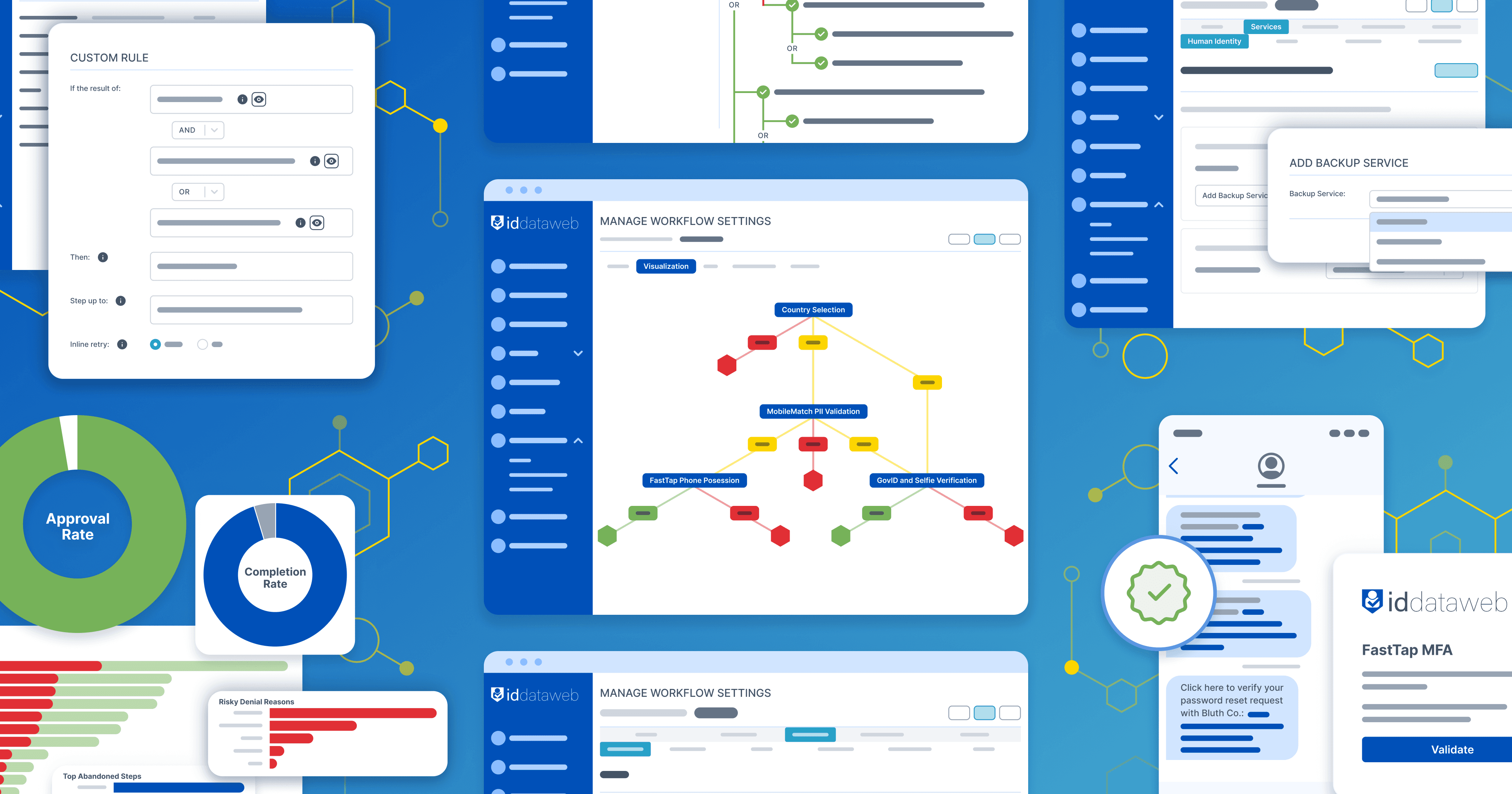
The shield in the ID Dataweb logo is built on the proportions of a regular hexagon. I used that geometry as the basis for a hexagonal grid-and-connector illustration style — visual shorthand for a company whose product exists to secure networks of connected systems. The style flexed between fully abstract compositions and UI blockframe mockups to express concepts like verification and fraud detection concretely.
Website
Restrained and clarity-first, letting the hexagonal illustration system and expanded blue palette carry the brand's personality through an otherwise conventional typographic structure.
The work expanded from there into illustration, advertising, sales collateral, and presentation templates — one system instead of five different ones improvised per project.
The Process
Defining the Brand Before Designing It
I began by defining who ID Dataweb actually was, landing on four core brand attributes: Trusted, Effortless, Dynamic, Practical. Because the website planning was already in motion and the business needed to move fast without losing existing brand equity, I made the call to retain the current logo and general color palette rather than introduce a third visual language in eighteen months. Every decision from there worked to reconcile that legacy equity with the new attributes:
Palette
The existing yellow read as alarm — at odds with Trusted and Effortless. I reverted to the original blue-forward palette, refined for accessibility and visual harmony, repositioned yellow and teal as accent colors rather than primary ones, and built error, warning, and success colors into the core brand palette rather than isolating them as system-notification colors.
Illustration system
The shield in the ID Dataweb logo is built on the proportions of a regular hexagon. I used that geometry as the basis for a hexagonal grid-and-connector illustration style — visual shorthand for a company whose product exists to secure networks of connected systems. The style flexed between fully abstract compositions and UI blockframe mockups to express concepts like verification and fraud detection concretely.
Website
Restrained and clarity-first, letting the hexagonal illustration system and expanded blue palette carry the brand's personality through an otherwise conventional typographic structure.
The work expanded from there into illustration, advertising, sales collateral, and presentation templates — one system instead of five different ones improvised per project.
The Process
Defining the Brand Before Designing It
I began by defining who ID Dataweb actually was, landing on four core brand attributes: Trusted, Effortless, Dynamic, Practical. Because the website planning was already in motion and the business needed to move fast without losing existing brand equity, I made the call to retain the current logo and general color palette rather than introduce a third visual language in eighteen months. Every decision from there worked to reconcile that legacy equity with the new attributes:
Palette
The existing yellow read as alarm — at odds with Trusted and Effortless. I reverted to the original blue-forward palette, refined for accessibility and visual harmony, repositioned yellow and teal as accent colors rather than primary ones, and built error, warning, and success colors into the core brand palette rather than isolating them as system-notification colors.
Illustration system
The shield in the ID Dataweb logo is built on the proportions of a regular hexagon. I used that geometry as the basis for a hexagonal grid-and-connector illustration style — visual shorthand for a company whose product exists to secure networks of connected systems. The style flexed between fully abstract compositions and UI blockframe mockups to express concepts like verification and fraud detection concretely.
Website
Restrained and clarity-first, letting the hexagonal illustration system and expanded blue palette carry the brand's personality through an otherwise conventional typographic structure.
The work expanded from there into illustration, advertising, sales collateral, and presentation templates — one system instead of five different ones improvised per project.



The Outcome
From Disjointed to Trusted Partner
Website traffic more than doubled year-over-year following the redesign.
The more significant result: United Airlines evaluated the new ID Dataweb brand and moved forward as a partner, inviting the company to speak publicly at a United-hosted event about the relationship. Where the brand had previously undercut the sophistication of the product, it now stood credibly next to a partner of that scale.
The Outcome
From Disjointed to Trusted Partner
Website traffic more than doubled year-over-year following the redesign.
The more significant result: United Airlines evaluated the new ID Dataweb brand and moved forward as a partner, inviting the company to speak publicly at a United-hosted event about the relationship. Where the brand had previously undercut the sophistication of the product, it now stood credibly next to a partner of that scale.
The Outcome
From Disjointed to Trusted Partner
Website traffic more than doubled year-over-year following the redesign.
The more significant result: United Airlines evaluated the new ID Dataweb brand and moved forward as a partner, inviting the company to speak publicly at a United-hosted event about the relationship. Where the brand had previously undercut the sophistication of the product, it now stood credibly next to a partner of that scale.


Previous case study

Strategic brand design that frees you from The Gray Dimension.
Strategic brand design that frees you
from The Gray Dimension.
Strategic brand design that frees you from The Gray Dimension.