DISCO
Complete identity redesign that took a legal technology startup from series B through IPO
The Problem
When DISCO had proven its product-market fit, it faced a critical business challenge.
While its cloud-based ediscovery software represented a generational leap forward for the legal industry, its brand identity was indistinguishable from the legacy competitors it sought to replace. The existing visuals lacked personality and failed to communicate the company's core difference. The primary business objective was to forge a new identity that would position DISCO as the undisputed future of legal technology, drive brand recognition in a crowded market, and significantly increase marketing leads.
The Problem
While its cloud-based ediscovery software represented a generational leap forward for the legal industry, its brand identity was indistinguishable from the legacy competitors it sought to replace. The existing visuals lacked personality and failed to communicate the company's core difference. The primary business objective was to forge a new identity that would position DISCO as the undisputed future of legal technology, drive brand recognition in a crowded market, and significantly increase marketing leads.
When DISCO had proven its product-market fit, it faced a critical business challenge.
The Problem
When DISCO had proven its product-market fit, it faced a critical business challenge.
While its cloud-based ediscovery software represented a generational leap forward for the legal industry, its brand identity was indistinguishable from the legacy competitors it sought to replace. The existing visuals lacked personality and failed to communicate the company's core difference. The primary business objective was to forge a new identity that would position DISCO as the undisputed future of legal technology, drive brand recognition in a crowded market, and significantly increase marketing leads.

The Process
To create a brand that was both authentic and differentiated, the process began with a deep strategic immersion. Through extensive interviews with founders and executive leadership, I defined four core brand attributes to act as our strategic north star: Focused, Optimistic, Unconventional, and Refined.
Following a comprehensive audit of the competitive landscape, these attributes directly informed every creative decision:
A Differentiated Palette
To embody the "Optimistic" and "Unconventional" attributes, a bold and vibrant color palette was developed. This was a deliberate move to break from the sea of conservative blues and grays that dominated the legal tech space, instantly signaling that DISCO was the future.
A Unique Visual Language
Taking inspiration from the simple geometry of the DISCO logo, a unique illustration style was created using abstract shapes. Rendered in the brand's vibrant colors, these visuals were unmistakably DISCO.
A Refined Foundation
The friendly yet versatile typeface Proxima Nova was chosen to ground the identity, providing a "Refined" and "Focused" foundation that ensured clarity and professionalism across all applications.
The result of this phase was a unified proof of concept that was a direct, tangible expression of the approved brand strategy.
The Process
Following a comprehensive audit of the competitive landscape, these attributes directly informed every creative decision:
A Differentiated Palette
To embody the "Optimistic" and "Unconventional" attributes, a bold and vibrant color palette was developed. This was a deliberate move to break from the sea of conservative blues and grays that dominated the legal tech space, instantly signaling that DISCO was the future.
A Unique Visual Language
Taking inspiration from the simple geometry of the DISCO logo, a unique illustration style was created using abstract shapes. Rendered in the brand's vibrant colors, these visuals were unmistakably DISCO.
A Refined Foundation
The friendly yet versatile typeface Proxima Nova was chosen to ground the identity, providing a "Refined" and "Focused" foundation that ensured clarity and professionalism across all applications.
The result of this phase was a unified proof of concept that was a direct, tangible expression of the approved brand strategy.
To create a brand that was both authentic and differentiated, the process began with a deep strategic immersion. Through extensive interviews with founders and executive leadership, I defined four core brand attributes to act as our strategic north star: Focused, Optimistic, Unconventional, and Refined.
The Process
To create a brand that was both authentic and differentiated, the process began with a deep strategic immersion. Through extensive interviews with founders and executive leadership, I defined four core brand attributes to act as our strategic north star: Focused, Optimistic, Unconventional, and Refined.
Following a comprehensive audit of the competitive landscape, these attributes directly informed every creative decision:
A Differentiated Palette
To embody the "Optimistic" and "Unconventional" attributes, a bold and vibrant color palette was developed. This was a deliberate move to break from the sea of conservative blues and grays that dominated the legal tech space, instantly signaling that DISCO was the future.
A Unique Visual Language
Taking inspiration from the simple geometry of the DISCO logo, a unique illustration style was created using abstract shapes. Rendered in the brand's vibrant colors, these visuals were unmistakably DISCO.
A Refined Foundation
The friendly yet versatile typeface Proxima Nova was chosen to ground the identity, providing a "Refined" and "Focused" foundation that ensured clarity and professionalism across all applications.
The result of this phase was a unified proof of concept that was a direct, tangible expression of the approved brand strategy.

The Outcome
The new brand identity acted as a catalyst for explosive growth, providing the credibility and differentiation needed to transform the business. The results were dramatic and sustained.
Dominated the High End of the Market
The rebrand was instrumental in DISCO moving upmarket. The company shifted from servicing individual cases at small litigation boutiques to securing full-firm adoption at the most prestigious Am Law 100 firms, contributing to over 100% year-over-year growth in the following years.
Fueled Monumental Financial Growth
This single brand identity was so powerful and enduring that it successfully carried the company through five rounds of venture capital funding. It served as the consistent face of the company for over five and a half years, culminating in a successful IPO in July 2021 with a valuation of $1.8 billion.
Enabled Massive Organizational Scale
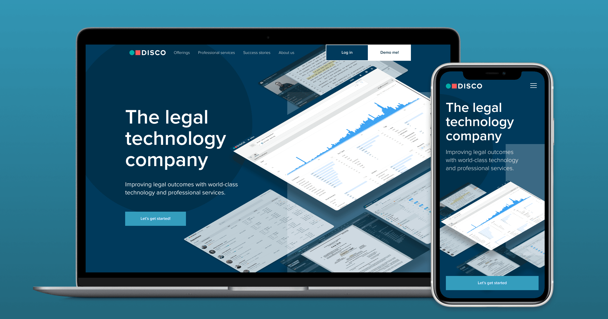
The brand was built as a scalable system from day one. It grew to encompass a complete collateral system, video and social media graphics, a corporate website, and sub-brands for major events. To empower an organization that scaled to over 500 employees, self-service templates were created, allowing teams to remain on-brand without creative bottlenecks and supporting a dedicated creative team of four.
The Outcome
Dominated the High End of the Market
The rebrand was instrumental in DISCO moving upmarket. The company shifted from servicing individual cases at small litigation boutiques to securing full-firm adoption at the most prestigious Am Law 100 firms, contributing to over 100% year-over-year growth in the following years.
Fueled Monumental Financial Growth
This single brand identity was so powerful and enduring that it successfully carried the company through five rounds of venture capital funding. It served as the consistent face of the company for over five and a half years, culminating in a successful IPO in July 2021 with a valuation of $1.8 billion.
Enabled Massive Organizational Scale
The brand was built as a scalable system from day one. It grew to encompass a complete collateral system, video and social media graphics, a corporate website, and sub-brands for major events. To empower an organization that scaled to over 500 employees, self-service templates were created, allowing teams to remain on-brand without creative bottlenecks and supporting a dedicated creative team of four.
The new brand identity acted as a catalyst for explosive growth, providing the credibility and differentiation needed to transform the business. The results were dramatic and sustained.
The Outcome
The new brand identity acted as a catalyst for explosive growth, providing the credibility and differentiation needed to transform the business. The results were dramatic and sustained.
Dominated the High End of the Market
The rebrand was instrumental in DISCO moving upmarket. The company shifted from servicing individual cases at small litigation boutiques to securing full-firm adoption at the most prestigious Am Law 100 firms, contributing to over 100% year-over-year growth in the following years.
Fueled Monumental Financial Growth
This single brand identity was so powerful and enduring that it successfully carried the company through five rounds of venture capital funding. It served as the consistent face of the company for over five and a half years, culminating in a successful IPO in July 2021 with a valuation of $1.8 billion.
Enabled Massive Organizational Scale
The brand was built as a scalable system from day one. It grew to encompass a complete collateral system, video and social media graphics, a corporate website, and sub-brands for major events. To empower an organization that scaled to over 500 employees, self-service templates were created, allowing teams to remain on-brand without creative bottlenecks and supporting a dedicated creative team of four.






Next case study

Strategic brand design that frees you from The Gray Dimension.
Strategic brand design that frees you
from The Gray Dimension.
Strategic brand design that frees you from The Gray Dimension.